Just a quick heads up: this website contains affiliate links, so I earn from qualifying purchases, which helps support this blog.
Picking spring wedding colors sounds easy until you’re staring at 200 sage-and-blush boards that all look identical. A good palette has to hold up in photos, on skin, across a whole reception. Here’s what goes together in 2026.
Spring Wedding Colors for 2026
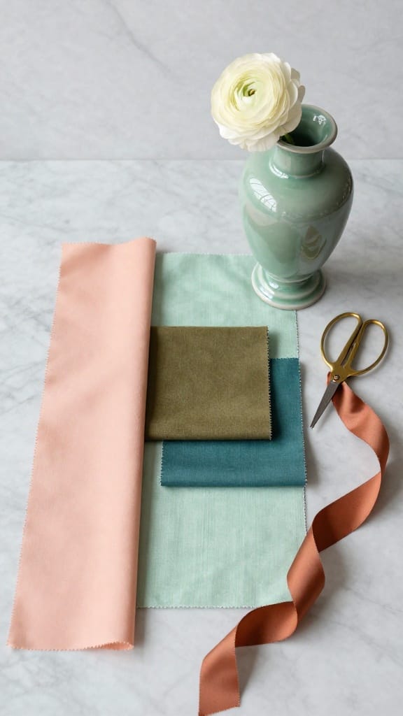
Pastels aren’t dead. They just can’t carry a whole wedding alone anymore. 2026 palettes layer one matte primary, one semi-gloss accent, one textured neutral.
The colors showing up: Jelly Mint (a soft, cool mint) for garden receptions. Paloma (burnt-salmon, terracotta-pink) for outdoor warmth. Olive for Japandi-forward ceremonies. Transformative Teal for coastal settings.
Pro tip: If your palette only names colors, it’s not done. Name the materials too. The fabric changes the shade more than you’d expect.
Pastel Spring Wedding Colors
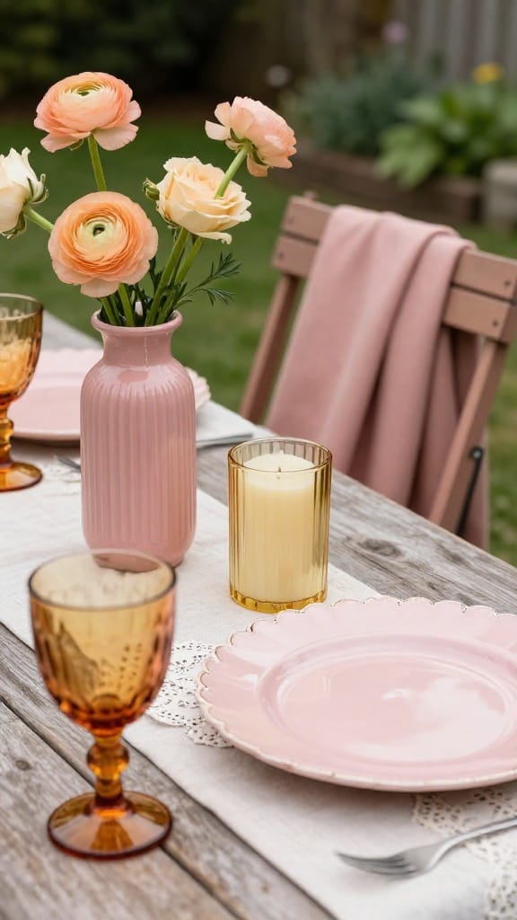
Peach Fuzz crepe bridesmaid dresses. Blush paper menu cards beside washed-sage cotton-lace napkins on ivory tablecloths. Amber vintage glassware holding peach ranunculus and cream garden roses. Pastel with a warm anchor in the frame.
One warm glass accent saves a pastel palette from going flat. Cheap satin sets with baby-blue hydrangeas wash out in daylight. Add Jelly Mint in textured napkins for a second temperature. Two pastels, one warm non-pastel.
Blue Spring Palettes Beyond Dusty Blue
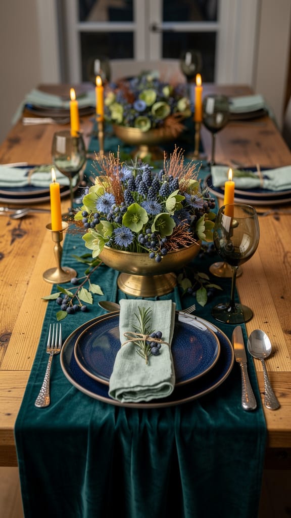
Dusty blue isn’t wrong. It’s just on every board you’ve already saved. Transformative Teal (WGSN’s 2026 pick) with Lavender-Smoke is the move. Ocean meets forest, paired with a cool grayed lavender.
Teal recycled nylon runners on walnut-stained tables. White napkins beside brushed-silver glassware. Smoked-glass bud vases with lavender sprigs. Coastal and editorial at once.
Ground the teal in matte textures. One glossy surface is enough. More and it looks like a spa lobby.
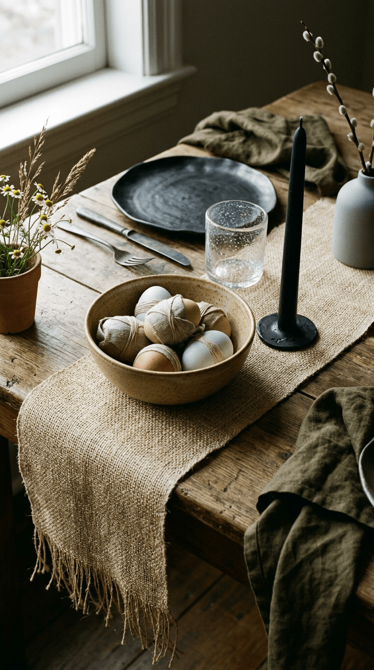
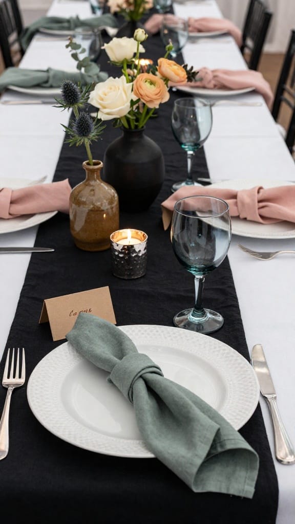
Green Palettes Beyond Sage
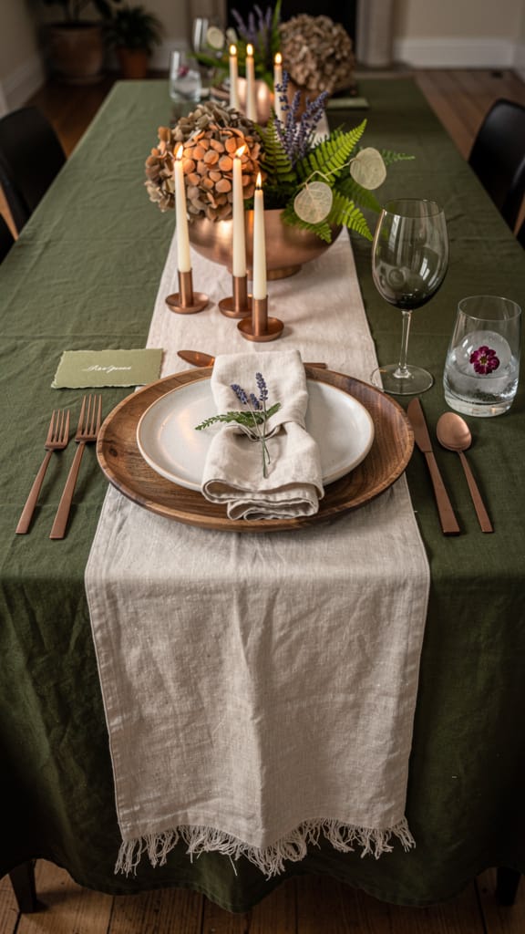
Not the dusty sage on every board. Deep olive linen tablecloths with orchid-dried lavender in brushed-copper vases. Muslin napkins beside wood-grain charger plates.
Chartreuse-leaning greens are the second option. The almost-yellow shade you see in spring ferns. Pair with one muted color in dried flowers. Orchid is the obvious partner.
Sleeper Pick: Olive and orchid together. Nobody’s doing it yet. That changes by fall.
Pink Spring Palettes Without the Blush Default
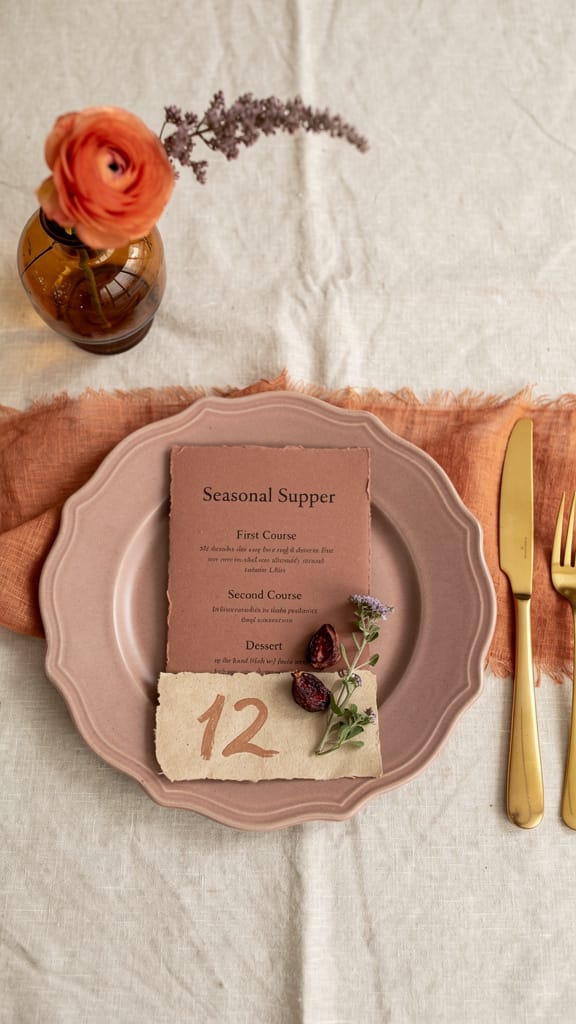
Peach Fuzz in crepe next to Paloma (burnt-salmon, terracotta-pink) in cotton-voile. Two pinks with completely different moods. Blush-on-blush in identical satin is the most pinned, least interesting version.
Terracotta-pink paper menus. Cream garden roses with peach ranunculus in amber bud vases. Soft gold cutlery.
The pink has warmth and dimension, not sweetness. Use blush in one place if it still pulls you. Paper goods or ribbon, not the dresses.
Save this palette before the venue walkthrough.
Sunset-Warm Palettes for Outdoor Receptions
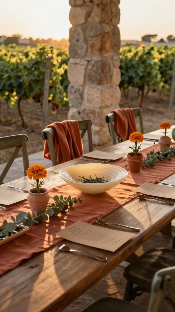
Cotton-voile bridesmaid dresses in Paloma tones. Terracotta-linen runners beside Dark Citron kraft paper menus. Dried-sage eucalyptus in matte-clay ceramic vases, mini terracotta planters with single marigolds as place markers. Golden-hour light does the rest.
Matte earthenware anchors this palette, not satin. Identical peach-and-coral on every surface with orange fairy lights kills the warmth. Keep the fabric sheer and draped. The light does the work, not the dye.
Best for: Vineyard or terrace receptions where the sun does half the styling.
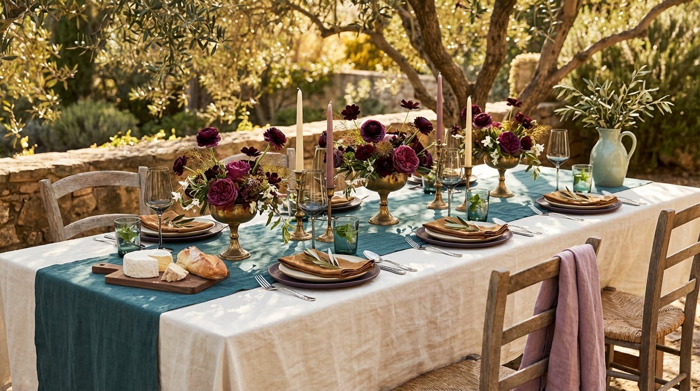
Fuchsia and Cobalt. For the Bold Couple.
Most bold palettes go wrong by putting the saturated color on everything. Electric fuchsia bridesmaid dresses in taffeta and satin beside cobalt velvet lounge chairs. White cotton tablecloths, matte-black acrylic signage with fuchsia-neon table numbers. Fuchsia LED uplighting in alcoves under the bar.
The color appears in the dresses and the light. Everything else stays matte neutral. Brushed-metal cutlery, not colored metal; white table fabric, not fuchsia. Restraint keeps bold from tipping into costume.
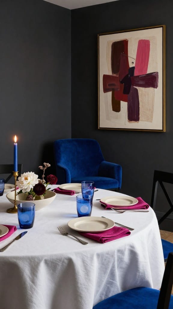
Spring Palettes with Black
Black linen table runners on white tablecloths beside soft gold cutlery. Ivory taper candles in matte-black ceramic holders. Charcoal silk bridesmaid dresses with dusty-rose sashes. Cream and blush garden roses against the black linen.
Black feels editorial when it frames, not fills. Table runner, yes; tablecloth, no. Chair sashes, yes; chair covers, no. It outlines soft colors instead of swallowing them.
Venue check: Warm bulbs (2700K) make pastels glow against black. Cool bulbs (4000K+) wash everything out. Ask your venue about their lighting before you commit.
Neutral Palettes That Show Up in Photos
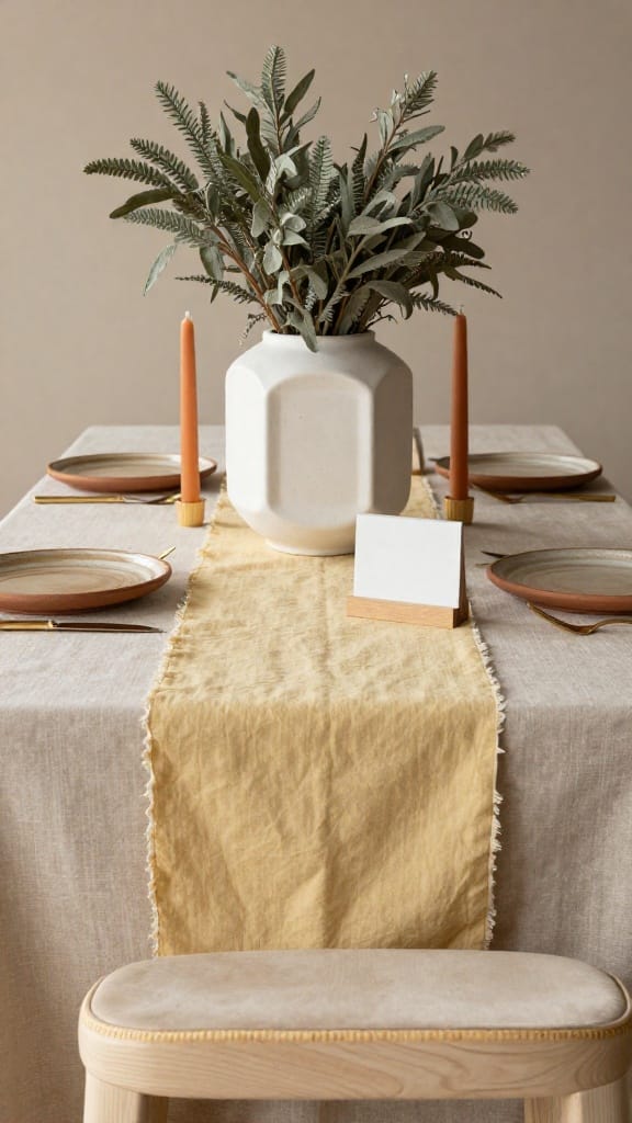
Taupe-ivory linen tablecloths with butter-yellow runners down the center. Sage dried foliage beside terracotta-chipped ceramic plates and brushed-brass cutlery. Terracotta beeswax candles in hand-thrown ceramic holders. Cream-velvet bridesmaid dresses, linen-cashmere for the mother of the bride.
All-white with silver-foil accents disappears in daylight. Three neutral tones in three textures is the fix: linen, velvet, ceramic. The camera picks up the shift between taupe, cream, and warm beige. Not one Pantone across every item.
Screenshot this one for your florist. Butter yellow in linen, not satin. That’s the detail that separates warm from costume.
Colors That Complement Deeper Skin Tones
Saturation and warm undertones glow on camera. Orchid wool-blend bridesmaid dresses beside cobalt velvet accents. Dark Citron table runners with brushed-copper and brushed-brass metals. Washed-out pastels flatten by comparison.
Electric fuchsia for the couple that wants bold. Jewel-adjacent, not full jewel. Full jewel looks too formal for spring. Orchid, teal, and warm fuchsia stay soft enough while showing on deeper complexions.
Skip This: Any palette labeled “universally flattering” with only three dusty pastels. Test on a range of skin tones, not just a mood board.
Bridesmaid Dress Colors for Spring
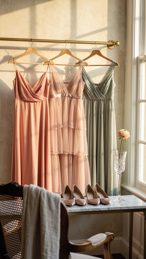
Three dresses, same palette, different fabrics: Peach Fuzz crepe, blush silk chiffon, washed-sage cotton-voile. Each dress picks one color from the table palette. The coordination is in the color story, not the material.
Match the palette, not the fabric. Crepe, chiffon, and cotton-voile in the same three tones look deliberate. Identical satin in three shades looks like a bulk order. Let each bridesmaid pick her fabric.
Groomsmen Colors That Coordinate
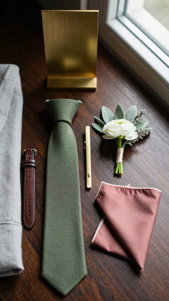
Light-gray linen suit with an olive-green knit tie and brushed-brass tie bar. Pocket square in dusty rose. Boutonniere: single ranunculus with a sprig of dried sage. The groom goes one shade darker in charcoal.
Pick the muted tone for the suit, the strongest color for one accessory. Tie or pocket square, not both. Two color accents on a suit looks like a costume. One looks like someone who thought about it.