Just a quick heads up: this website contains affiliate links, so I earn from qualifying purchases, which helps support this blog.
Saturday morning. Sun on the pillows, and you’re staring at the same white bedding you bought in 2022. Colour, texture, one wall. That’s all it takes.
Spring Colour Schemes That Go Beyond Blush and White
Three colours. One dominant, one supporting, one accent.
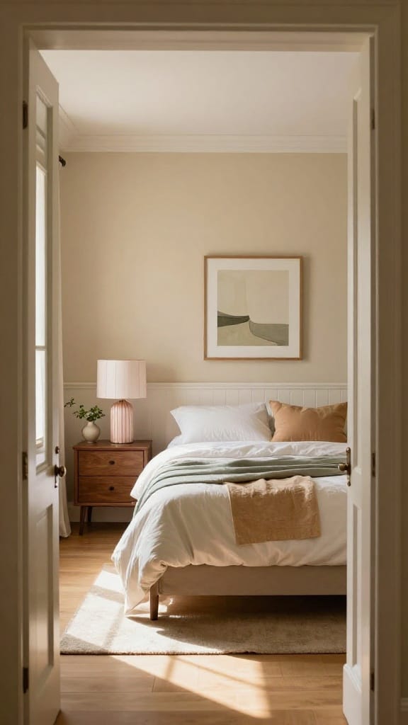
Warm oat on the walls, sage bedding, terracotta cushion. That’s earthy spring. Cloud blue base with lavender shams and warm white cotton if you lean cooler. Butter yellow armchair against muted green bedding and cream walls if you want something nobody has yet.
Pro tip: Pick your accent last. It’s the smallest piece, so it’s the cheapest to swap if the combo doesn’t land.
Green Spring Bedrooms (And Not Just Sage)
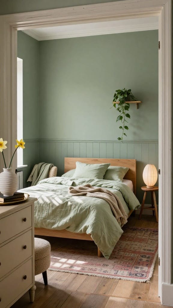
Sage gets all the attention. But smoky eucalyptus (a mid-tone green with a gray haze) hits differently on a full wall.
Matte finish on the walls. Honeydew green linen bedding. Soft sage cushions piled against a light oak headboard. Seagrass basket on the floor. One trailing pothos on the nightstand. The palette moves between three greens instead of sitting flat.
Pink Without the Princess Vibe
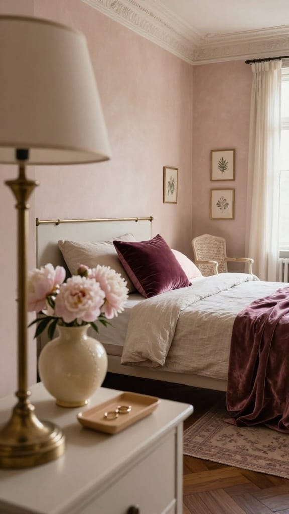
Blush-beige on the walls, not baby pink. There’s a range between bubblegum and barely there that most people skip.
Linen sand bedding. One deep muted plum velvet pillow. Warm oat cushion. Vintage brass lamp on the nightstand with a fabric shade. The pink is there, but it reads grown-up. Closer to faded rose than candy wrapper.
Best for: Shared bedrooms where one person wants pink and the other wants literally anything else.
Why Blue Works Better Than You’d Think
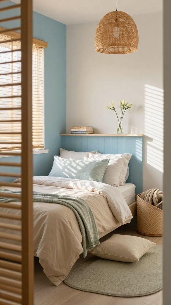
Cloud blue. Not royal, not navy, not baby. A soft blue with a gray hint, the kind that shifts depending on the light.
One wall in cloud blue, rest in warm white. Bedding in sand with a faint watercolor-print cushion in the same blue family. Small check throw in soft sage across the foot. Bamboo blinds filtering afternoon light.
Blue bedrooms need warm bulbs. Skip the 4000K cool-white LEDs or the whole room goes clinical.
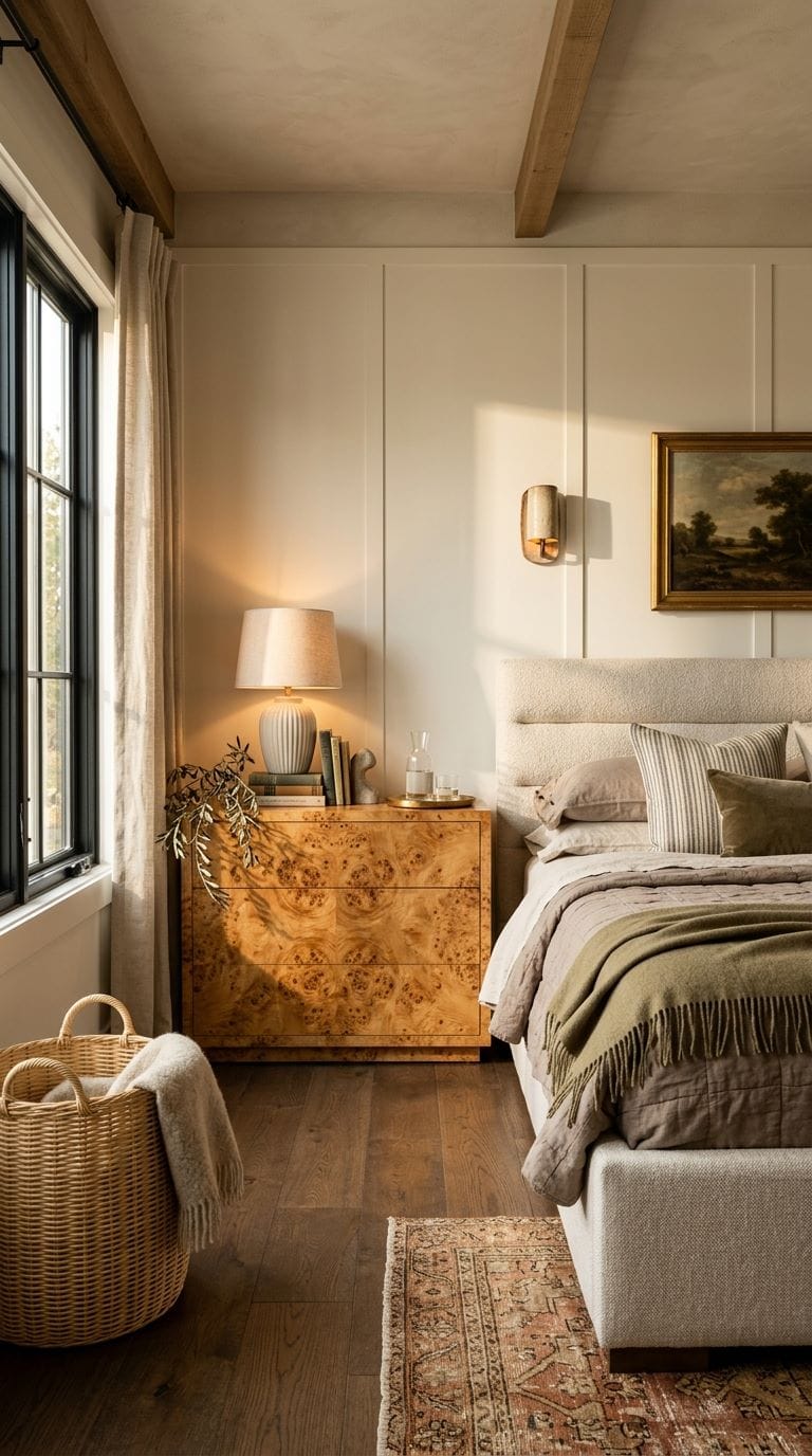
Bedding and Blankets That Actually Look Layered
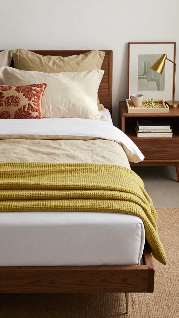
White percale sheet as the base. Linen-look cotton duvet in sand on top. Waffle-textured cotton throw in honeydew green folded at the foot. European shams in washed cotton sateen. One faded embroidered pillow with terracotta and beige motifs propped in front.
Smooth to rough, light to heavy. Each layer should feel different to touch. Matching sets look flat in photos and worse in person.
Screenshot the layering order. You’ll want it at the shop.
Yellow and Purple. The Spring Colours Nobody’s Using
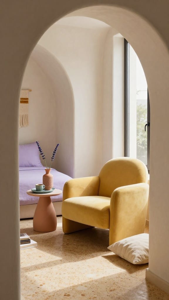
Butter yellow matte armchair by the window. Pale lavender cushion shams on off-white bedding. Walls in warm white, one small accent in muted turquoise. A ceramic tray, a single vase.
The palette feels spring with no pink and no green in sight. Warm ochre undertones in the yellow keep it grounded.
Sleeper Pick: Muted lavender. Everyone skips it. Pair it with butter yellow and the room feels like early April.
Heritage Florals on Everything
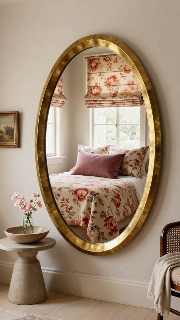
Not the chintz your gran had. Faded, soft, almost washed-out florals on linen bedding. Roses in terracotta and cream against an oat background.
Roman blinds in the same print but a lighter colourway. One solid muted plum cushion to anchor. Watercolor-style floral shams layered behind the solids. The pattern reads vintage, not dated.
Pro tip: Match the floral to one solid. If the print has terracotta, the solid cushion is terracotta. One echo keeps it together.
The Cocoon Bedroom (Padded, Wrapped, Quiet)
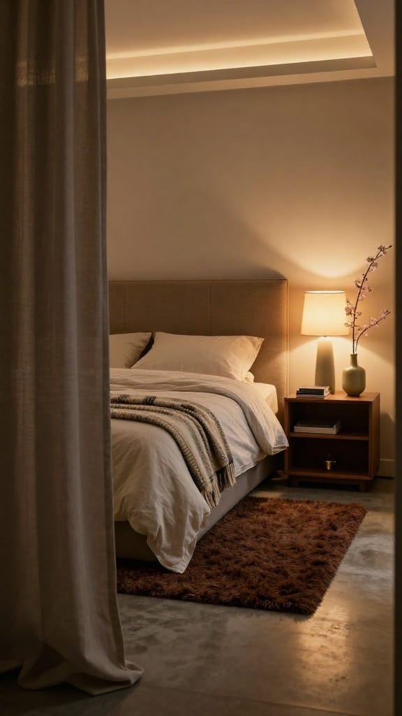
Padded headboard in warm mushroom, extending into upholstered wall panels. Floor-to-ceiling drapery in soft warm gray. Heavy washed cotton bedding in off-white. Chunky cream and charcoal wool throw. Chocolate brown short shag rug underfoot.
One hard surface saves it. A wood nightstand or a brass lamp base. All softness and no edge? Padded cell, not cocoon.
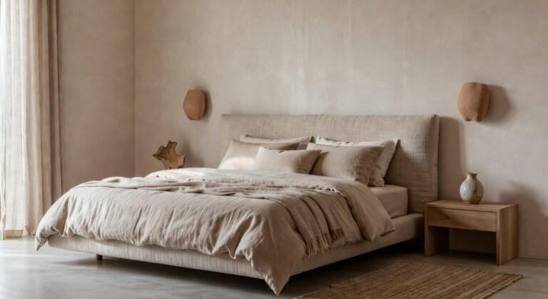
Warm Oat and Mushroom If You’re Over Colour
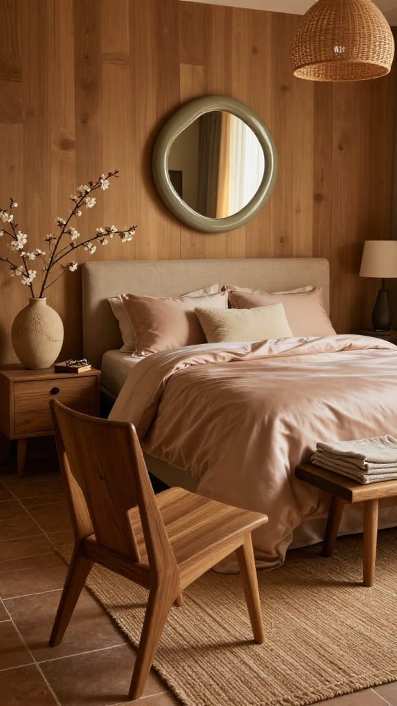
Neutral doesn’t mean one colour. It means three warm tones that shift depending on the light.
Walls in warm oat. Headboard in mushroom. Bedding in blush-beige cotton sateen. Jute rug with a knotted weave. Raw wood nightstand. One curved mirror above the bed, not centered but slightly off to one side.
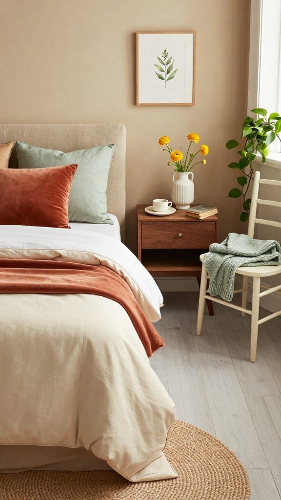
Spring Refresh for Couples (When You Both Have Opinions)
Warm beige walls. Lived-in, not staged. White percale base, two throws in different textures but the same warmth. Soft sage for one side, warm khaki for the other.
Matching nightstands, different lamps. A muted green throw folded at the foot. The room doesn’t lean feminine or masculine. It leans warm.
Skip This: The his-and-hers pillow approach. Two clashing aesthetics on one bed never lands. Pick a shared palette and vary the texture instead.
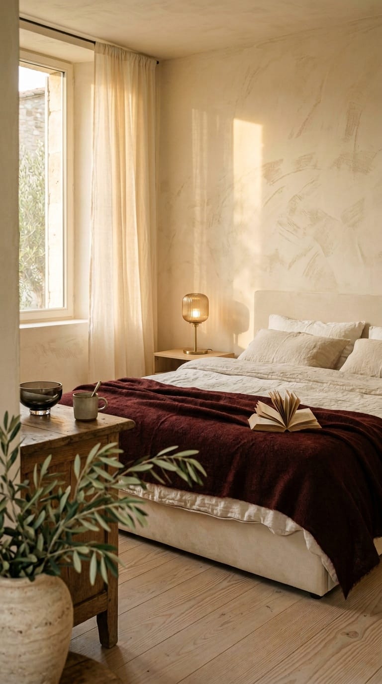
Bold Walls, Matte Finish. Grown-Up Colour on One Wall
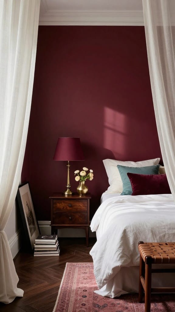
Deep burgundy on one wall. Matte, chalky finish. Three walls in warm white. White percale bedding, one muted turquoise cushion, one burgundy velvet pillow. Vintage brass lamp with a burgundy fabric shade.
Inky blue does the same job if burgundy feels too warm. Same rules. Matte finish, one wall, light-coloured everything else.
The matte absorbs light instead of bouncing it. Glossy reads accent wall from 2014.
Small Space Spring Bedroom. No Clutter.
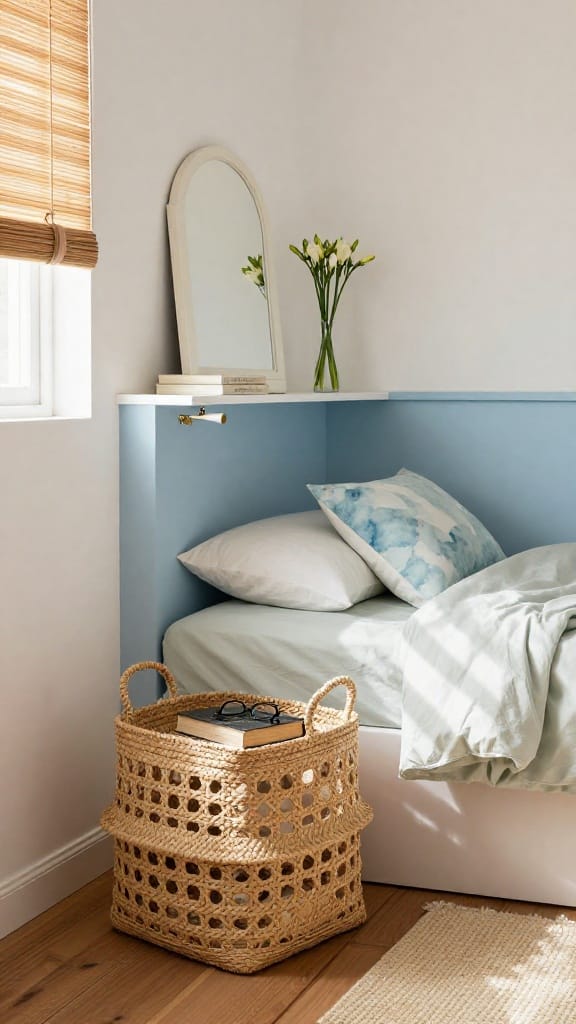
Warm white walls. Cloud blue painted rectangle behind the headboard. Not a full wall, just the bed area.
Light cotton bedding in soft sage. One watercolor-print cushion. Bamboo blinds, no curtains. Seagrass basket doubling as nightstand and storage. Every piece earns its spot.
Best for: Studios and first bedrooms where you can’t fit a dresser.
In a small room, texture does what colour does in a big one. Three textures, two colours, zero visual noise.